An essential element of any design is color. Color is a science, yet it’s also taught as a theory. Every color carries meaning and deep associations. It’s true for brands and their designs too. Doritos and Coca-Cola have both experimented with changing the colors of their packaging and received negative results. Consumers said the chips and soda actually tasted different. Did these companies change anything about how they made their products? No. It was the change of color that changed consumers’ minds.
A few questions I often hear about color: “Why is color important?” “Can’t we just replace the green with orange?” “Can you make it Coca-Cola red?” But color choice is so much more than simply swapping one color with another. Color choices should be intentional and made carefully.
In western culture, white is the color of purity and weddings, but in eastern cultures, it’s associated with death and funerals. Colors can carry a lot of meaning. Certain ones may represent different things to different people, while the meanings of others are more universal. When you see blue, what do you think about? The sky? Water? Freedom? When we see colors, we make subconscious associations with them. Bright red might make someone instinctively think of danger or that something is wrong, while natural brown and green tones relax the viewer.
Another great example of how much weight colors can carry appears in the movie “The Devil Wears Prada.” Miranda, a fashion magazine editor, explains to her assistant how much time, consideration, and money went into the color of her cerulean sweater.
Color can say a lot about your company or brand without using any words. Many companies will use this to their advantage, and some will even trademark a color. Think of a few company/color combinations. The Home Depot has a trademark on its specific shade of orange. Before you even see the name, you associate the color orange with construction and the company. Cadbury’s signature purple was also not a random selection. Purple was used for centuries by royalty and those who could afford the finer things in life. There is no color better suited to represent a luxurious chocolate than a royal purple.
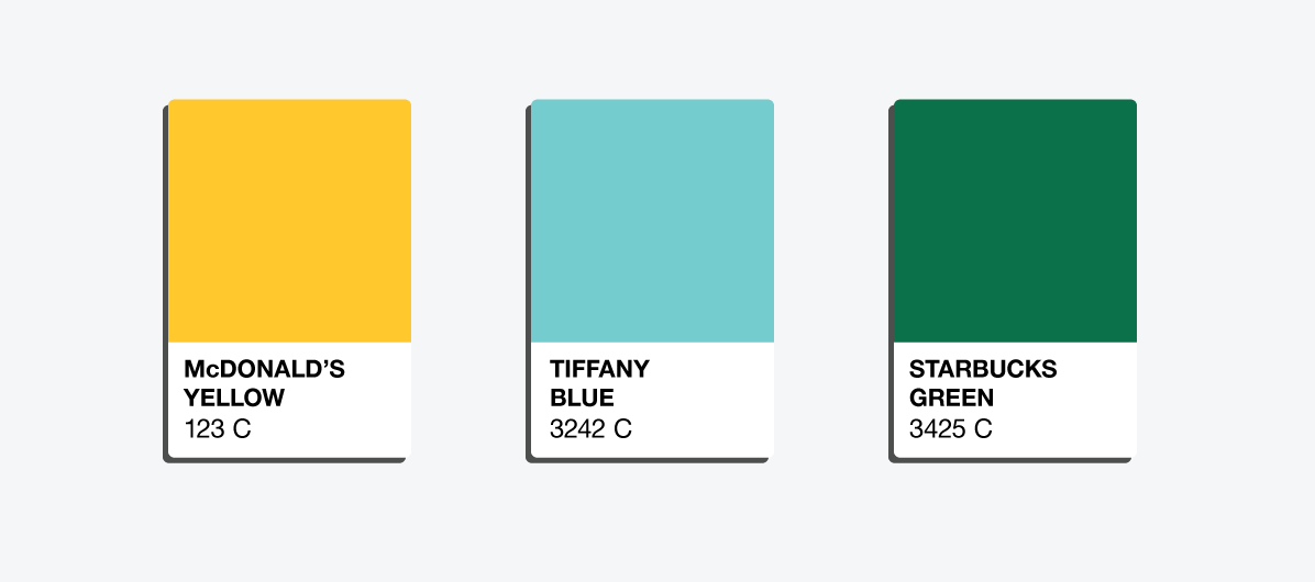
Ask yourself: Would the Starbucks logo be the same with a different shade of green? Would McDonald’s be as recognizable without the yellow arches? Would a Tiffany’s box be as delightful if it weren’t blue?
When selecting colors, spend time thinking about what the colors say without words. The right choice will allow your colors to speak for themselves.
Stay splendid,
Matt