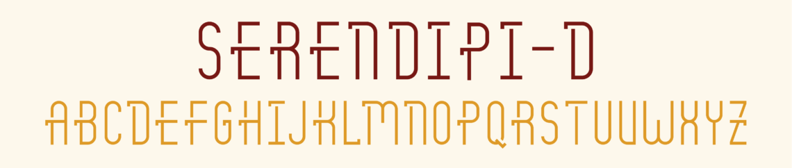
Serendipi-D
Serendipi-D
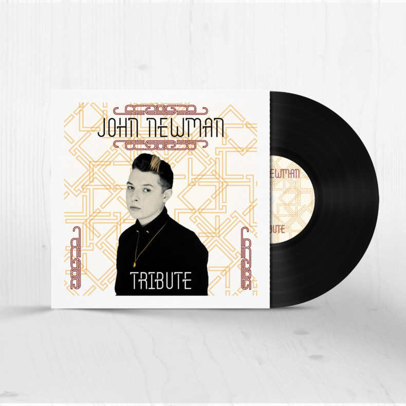
The need arose for my to create a new display typeface. After looking at a wide variety of typefaces, settled on what I would call a pseudo-serif. After experimenting with various types of serifs I had a “serendipitous” mistake, and I ran with it. The end result was a monoline pseudo-serif with a gap below directly below it. A name such as serendipity conveys an understanding of a surprise with whimsical and scripty undertones. My typeface on the other hand is highly structured with a digital quality; thus I named it Serendipi-D for the pleasant surprise and the digital feel.
Project Scope:
Typeface Creation
Client:
Personal Project
Delivery Date:
December 2014